
Welcome all!! Thread Matters for May 2020 allows me to welcome back Aurifilosopher Tammy Silvers of Tamarinis. Tammy is an amazing pattern designer, a fabric designer for Island Batik, an educator, a Studio 180 Certified Instructor, and truly one of the biggest cheerleaders you’ll find in the quilting industry. Tammy shares her passion for and knowledge of embellishing with us this month. You’ll be wowed with what she does the beautiful colors of the May color builder, Sardinia.
If you missed the 2019 introduction of Aurifilosophy and this fun new Thread Matters series click here to read more. Consider scheduling an Aurifilosophy Program for your shop, group or guild – learn more here.
Happy Stitching!
Karen L. Miller ~ Redbird Quilt Co.
Sit down, dear quilter, and let me tell you a tale… a tale of thread and fabric, color and texture… that all began with the magical Sardinia Color Builder collection.
Ok, so maybe most fairy tales don’t begin this way, but getting to work with Aurifil’s Sardinia collection– three lovely 50wt spools that evoke soft sand beaches and the beautiful pinks of sea shells, sand at sunrise, and cheeks pinked by the sun– was truly magical!

You might think, therefore, that my project would be “beachy”. So here’s the story’s twist. Nope. No beaches, no shells, no sand. Instead, the three pinks in the collection inspired the color palette for the project. The soft pinks seemed ideal for a reimagining of my new appliqué project, Good Fortune, which features three different appliquéd hamsa hands. (Pre-order the pattern HERE.)

Often the hamsa amulet is shown either in black and white or in bright colors. Using the Sardinia collection as inspiration, I created a softer version in cream, gray, and pink.

For the stitched embellishment, I also thought it would be fun to mix in some other thread weights into the project. I favor a simple edge stitch for embellishment, which gives a clean modern look to the applique, and really showcases the threads.

Let’s look a bit closer at the project and how using different weights can add dimension.
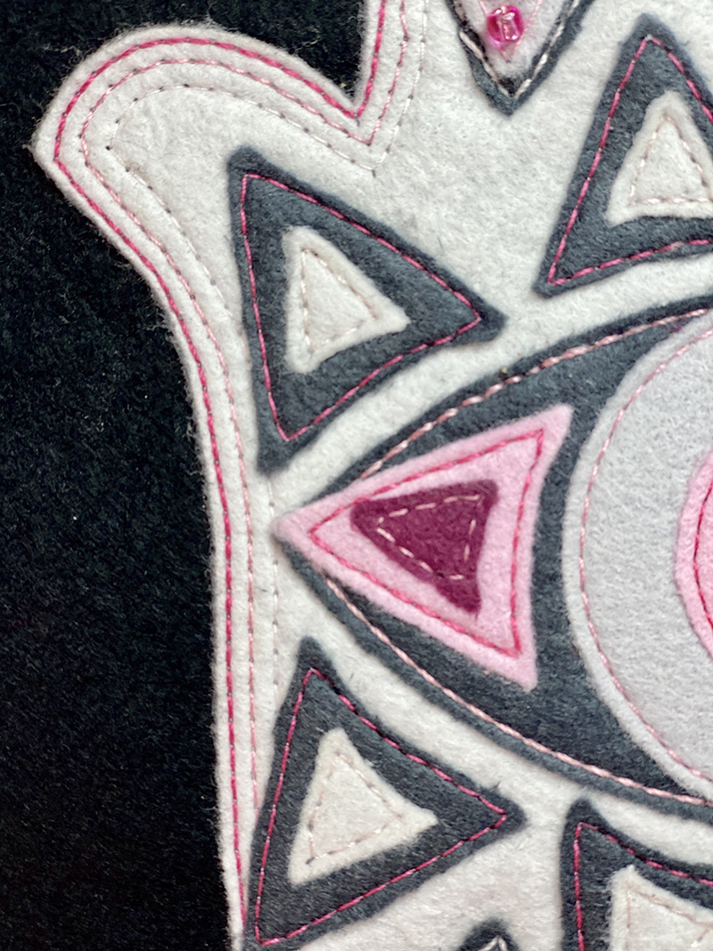
For my Hamsa hand base appliqué, I chose a creamy white wool so that the threads would really show up. I wanted to give a gradation effect with the edge stitching. Using a 12wt dark pink, I edge stitched 1/8” away from the base applique. The medium pink in a 28wt was used for the next row of edge stitching, and a 50wt in the light pink completed the inner row of stitching. By decreasing the size of the thread as the color lightened, it gave a lovely effect of the thread fading away from the edge.

Once I added additional appliqués onto the base, I used a heavier weight thread and a higher contrast to really accentuate the thread. For lower contrast, I used a lighter thread AND a lighter weight. For my tiny white triangles, I used the light pink in the 50wt, and it almost disappears into the wool, giving just a bit of texture without adding much color – which is exactly what I wanted.


For more contrast on the gray appliqués, the dark and medium pinks in 12wt and 28wt worked perfectly.

Some tips for a successful machine stitched fusible applique project:
- Odif 505 basting spray works wonderfully to hold the motifs in place without gumming up the needle.
- Work on the project in layers to minimize stops and starts.
- For the Hamsa Hand, place the hand appliqué on a slightly oversized base and edge stitch around the entire piece before adding additional pieces.
- Add one layer at a time, and position pieces before stitching to ensure proper spacing.
- Don’t forget to increase stitch length as you go. With each additional layer, some of the stitch length will be taken up by the thickness of the appliqué. This is true no matter what your medium is – batiks, cottons, linens, or wools.
- Use the appropriate size needle for your threads:
- 50wt = 80/12 sharp
- 28wt = 90/14 sharp
- 12wt = 90/14 or 100/16 sharp
- As the thread weight increases, it will be necessary to slow the stitch speed. At higher speeds, 12wt will begin to skip stitches, so slow and steady for the best results!
- Loosen the top tension for 12wt stitching to minimize stress on the thread and reduce fraying.
- When possible, match the bobbin thread color to the top thread. For my project, including all weights, I used a 50wt in the bobbin.
Your key take-away from this: mix up your thread weights when embellishing, embroidering or top-stitching. It adds a bit more depth and texture to your beautiful project!
Many thanks to Aurifil for letting me play with these beautiful threads! I had grand plans of having a redwork version of the project as well, in the Sardinia colors in floss! But… best laid plans and all that. I’ll share it with you when I do get it done!
Thanks so much to Tammy for sharing her project and her fabulous tips!
ABOUT TAMMY
Blog — Facebook — Pinterest — Twitter — Instagram
 Tammy Silvers is the designer behind the brand Tamarinis. She’s been designing quilts for 10 years, and prides herself on offering bold, fresh new patterns for quilters of all levels. She enjoys working with almost any fabric, but her favorites (the one that makes her drool and blow a carefully constructed budget) are batiks, bold prints, and chicken prints. Having a background in art and literature, another of her guilty quilty pleasures is finding ways to use “words” in her work, be it in the fabric itself or by adding them to the piece.
Tammy is a Georgia native and currently lives in Acworth with her husband, children (when they come to visit!), dog, and her favorite fat cats.
Under the label Tamarinis, her designs are regularly published in a variety of quilt magazines, including Quilt, McCall’s Quilting, American Patchwork and Quilting, Stitch, Fons and Porter’s Love of Quilting, Quilty, Quilt It…Today, Sew It…Today, Stitch and Create and Decorate. She also works with some of the major fabric manufacturers designing projects to showcase and promote their fabric lines, including Island Batik (of course!), Northcott Fabrics, Blend, Camelot and Fabri-Quilt.
1 comment